Suffolk Building Society
Reimagining a building society’s brand to reignite relevance
Services
Brand guidelines
Brand strategy
Visual identity
62%
Increase in new members
7%
Growth in mortgages booked
£34M
Savings balances increase
The Brief
When we met Ipswich Building Society they were already a locally famous brand – its fame the function of a long history of service and as a 200-year staple of Suffolk high streets. But that ubiquity was part of the problem.
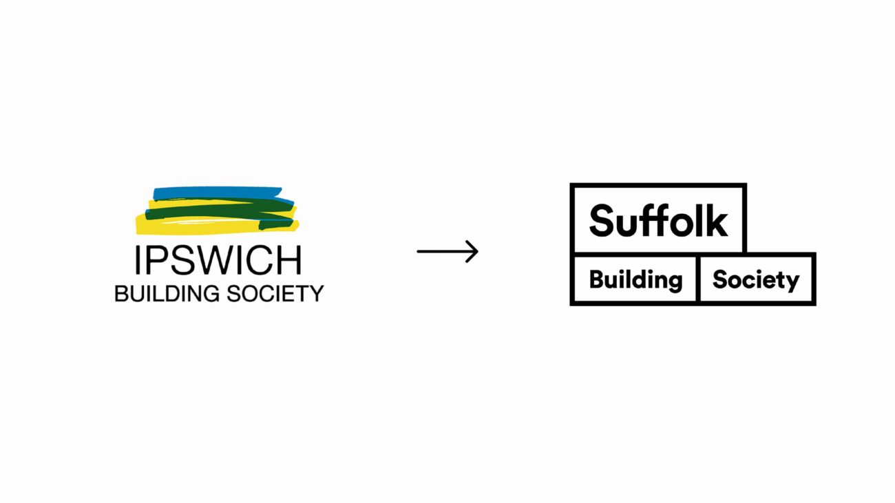
The brand had lost relevance and, as a result, they risked missing an entire generation of potential customers. In an effort to broaden their appeal, they decided to return to an old name: Suffolk Building Society.
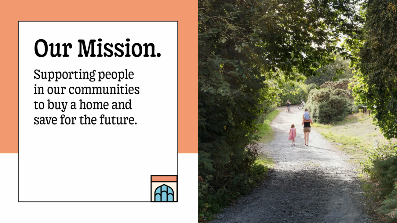
Our role was to help them evolve the narrative and visual identity of the brand to better reflect the modern community they wanted to be a part of – and to put the community at the heart of everything they do.



The Strategy
The brand positioning strategy was a way of bringing the foundational elements of the SBS story into the modern era: Restating the importance of old-world values for new generations. The building blocks of mutuality, community-focus, regional connections and unwavering principles felt not only fundamental but incredibly relevant in a time when more and more people are questioning corporate motivations, and placing greater emphasis on their neighbourhoods.
We ran a series of internal sessions to workshop the brand story and values, and commissioned a blend of quantitive and quantitative research to understand and quantify key audience’s attitudes, giving confidence to the membership proposition as well as informing new brand activation ideas.
The Creative
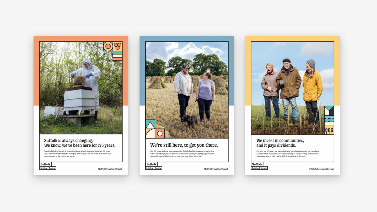
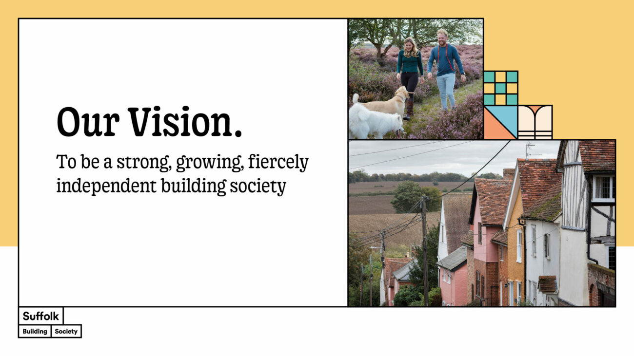
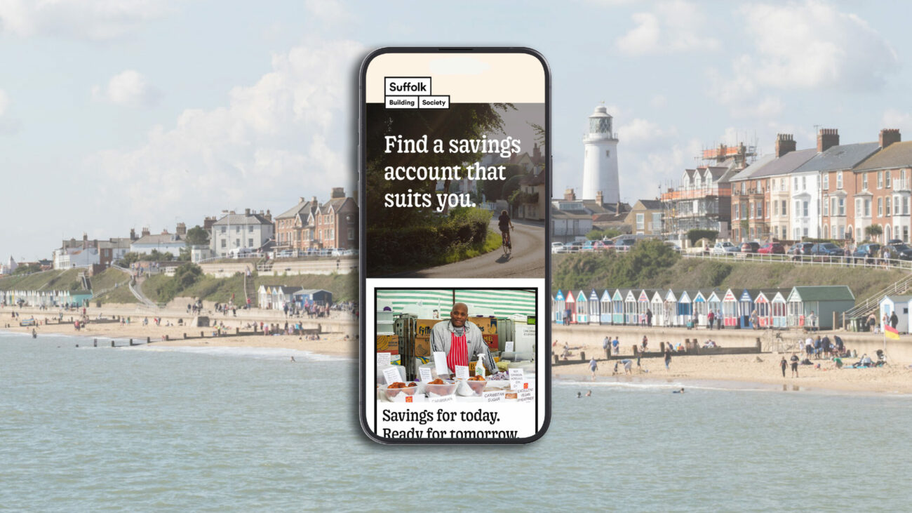
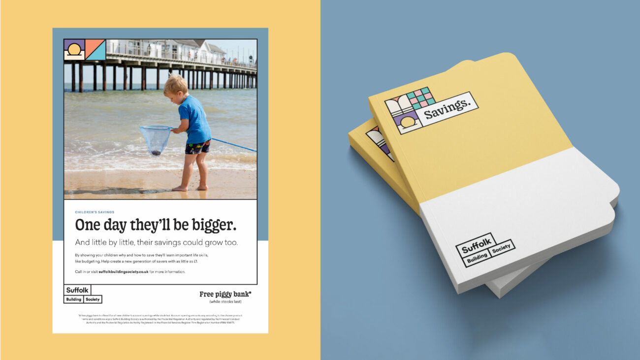
The logo is inspired by the historical buildings of Suffolk – and of the places SBS literally helped build (you can still find their initials on the buildings the society funded over 150 years ago). And we produced the ‘Suffolk Tiles’ – a collection of tiny, hyperlocal emblems that help to locate the brand in the specific places of Suffolk that they serve.
Beyond creative execution, our process included the establishment of a brand strategy (narrative and values), and we worked with the team to support the embedding and internal ownership of the evolution to Suffolk Building Society.
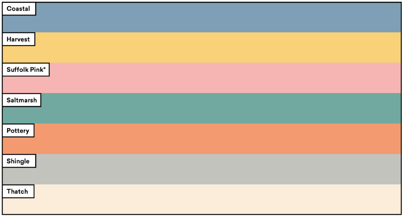
The colour palette
It is inspired by the heritage colours of the county – both the historical buildings and the environments they sit in. Some of them are even taken from guidelines for listed buildings, published by local authorities.
The design system
We wanted to balance old and new, created to reflect the best of the brand’s history brought into the present – to represent their connection with Suffolk, whilst opening their community to everyone – to place their members and their stories at the heart of the brand.
The photography
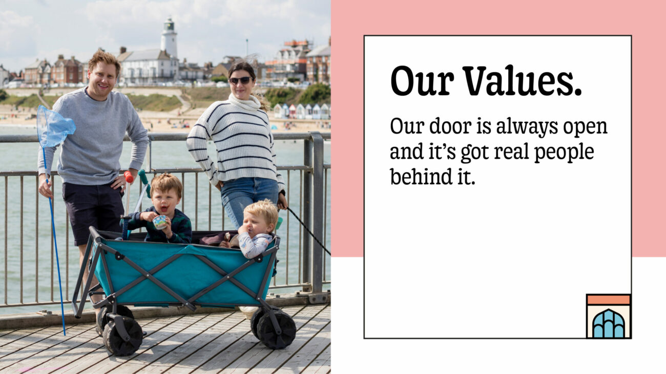
We commissioned local photographer Richard Allenby-Pratt (aka The Suffolk Project), whose personal work documents and celebrates real Suffolk lives. It meant our imagery was totally authentic, a genuine celebration of the members and their lives.


The Results
“At Suffolk Building Society we talk about being a good neighbour, and working with Borne felt exactly like that, strengthened by collaboration, respect and understanding,” said Lee Gladwell, Chief Commercial Officer, Suffolk Building Society
In 2022 Suffolk Building Society saw a 62% increase in new members, grew their mortgage book by 7%, and their savings balances increased by £34m.
By the time it came to launch, Suffolk Building Society didn’t just look the part – they played the part. Ready to prove that community isn’t just where you are; it’s how you are.
And others recognised it, with the award of Best Building Society at the UK Bank Awards.


