Norse Group
A rebrand uniting people & purpose: 9,000 people, 4 divisions and council partners
Services
Brand guidelines
Brand strategy
Logo design
Rebrand
Tone of voice
Visual identity
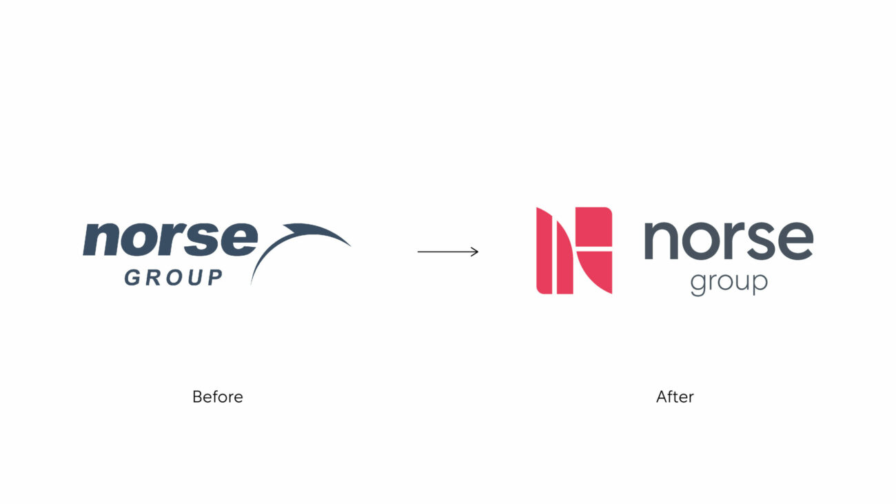
The Brief
Norse Group is the UK’s largest Local Authority trading company comprising Norse Care, Norse Consulting, Norse Commercial Services and Norse Specialist Services.
But despite being around for 30+ years, and being an organisation of over 9,000 people, it had a problem: it operated in silos and, on occasion, was seen as a disjointed organisation externally. Its outward facing image was not representative of where the market was going and what the market required. Overall, there was a limited understanding of what the real benefits were, as a whole united entity.
Borne was brought in to develop an overarching brand strategy that reflected the Norse Group strategy of coming together as one group. This included creating a visual identity that defined and brought to life a differentiated group-level proposition, provided a clear brand architecture, a universal set of values, a cultural ‘North Star’ and an external strapline that would give them a clear and defining internal and integrated external positioning.
The Challenge
“We identified that in many ways the external-facing problem was due to an internal disconnect,” explains Head of Strategy, Chris Bosher. Driven by its business units and the addition of joint ventures, Norse Group had grown exponentially. But there was no unity: each business unit and company in its portfolio had become siloed.
Insight was the product of an extensive research process interviewing stakeholders, customers, and partners. “No one person in Norse could tell you everything that Norse did,” explains Chris. It also became apparent that, nationwide, county councils are on their knees – years of cuts are being felt, and it’s the communities that are suffering. And there was a perception amongst partners that whilst Norse’s private sector competitors offered the capability they needed, their pursuit of profits first and foremost created an environment that questioned the value for money.
Our role was to help Norse define a narrative and brand architecture first, articulating who they are, what they do, and why they do it. Followed by a visual identity; finding a solution for the group that reflected Norse capabilities, and signalled its ethical origins.
“But in addition to this, we understood that there was a business need to deliver a solution that met the needs of senior stakeholders unilaterally,” says Chris.
The Solution
Strategically, the solution came from the identification that Norse, its clients, and partners share the same values, have the same beliefs, and all want to live in a society of thriving communities.
Norse Group was born from the public sector, for the public good. It places people at the core. Its model means that they partner with councils, sharing profits, and delivering for communities over the long term. All of their 9,000 people are emotionally engaged in improving people’s lives through the work they do – and when the various capabilities of the group are brought together, the sum is greater than its parts.
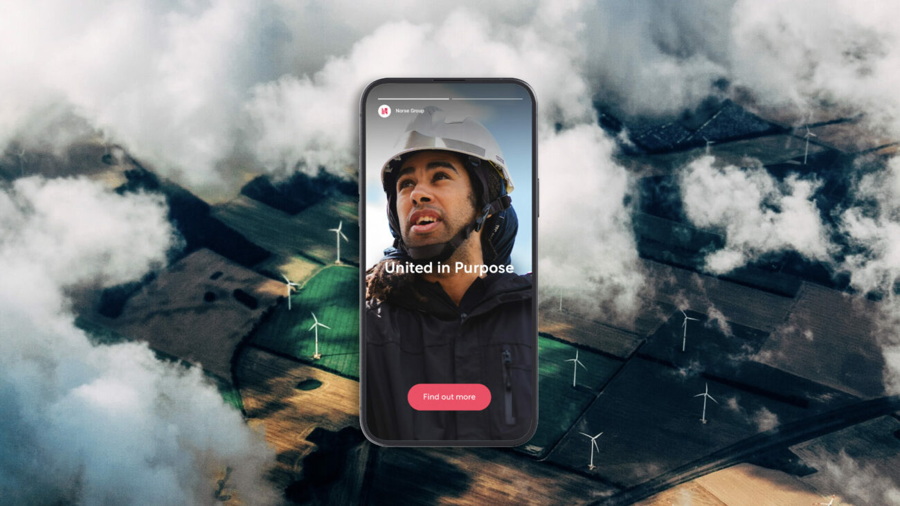
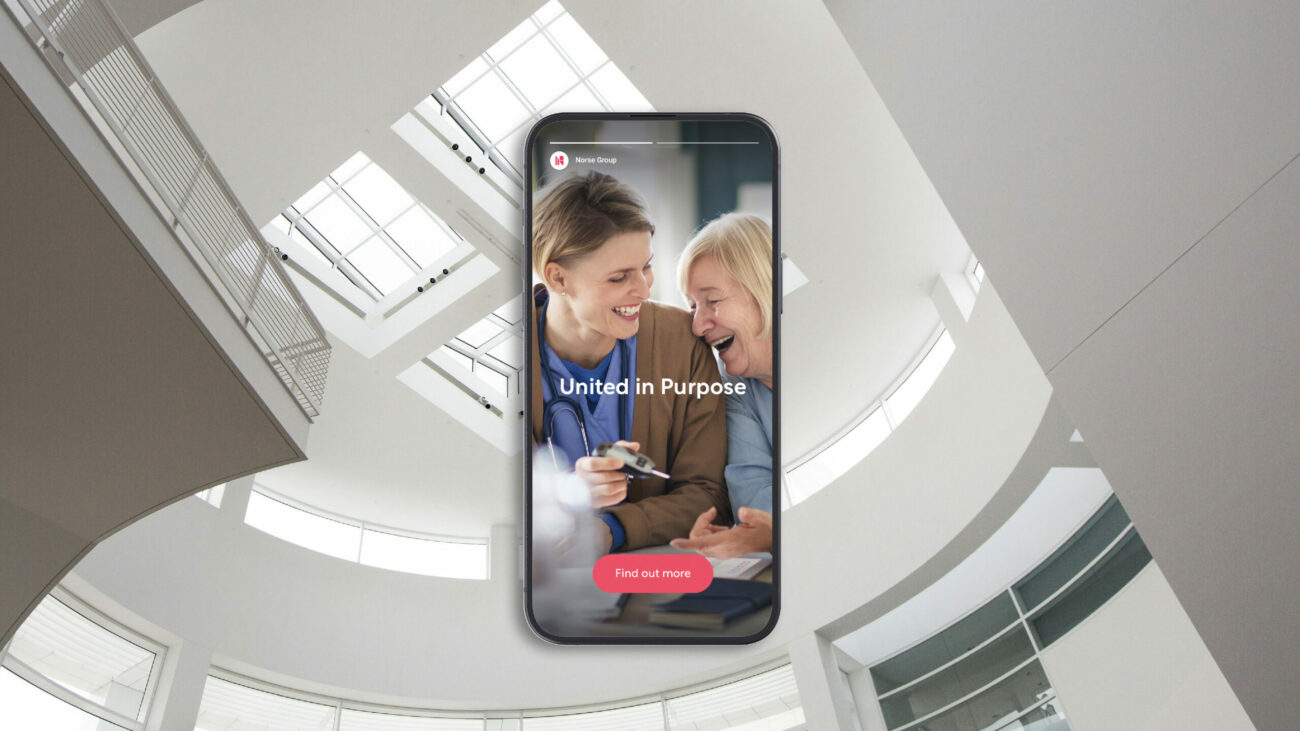
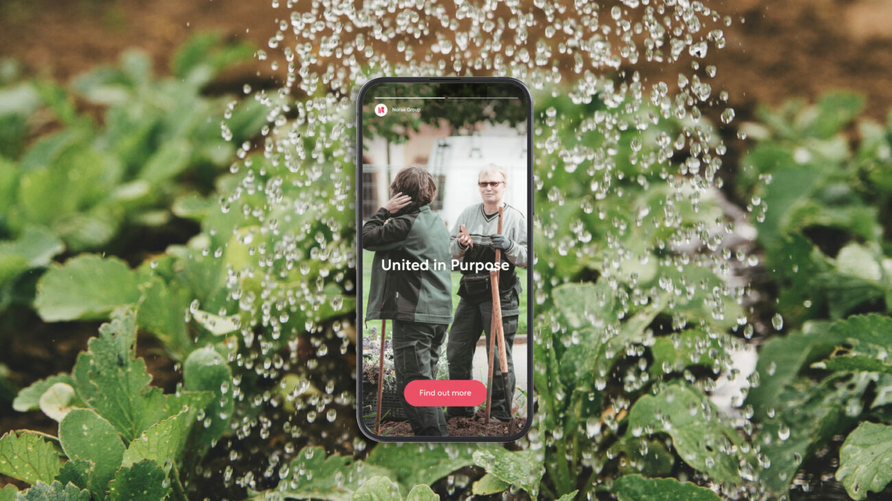
This was the essence of the positioning – and the new Norse strapline speaks to this story of unity, capability and partnership: United in Purpose.
Visual Identity
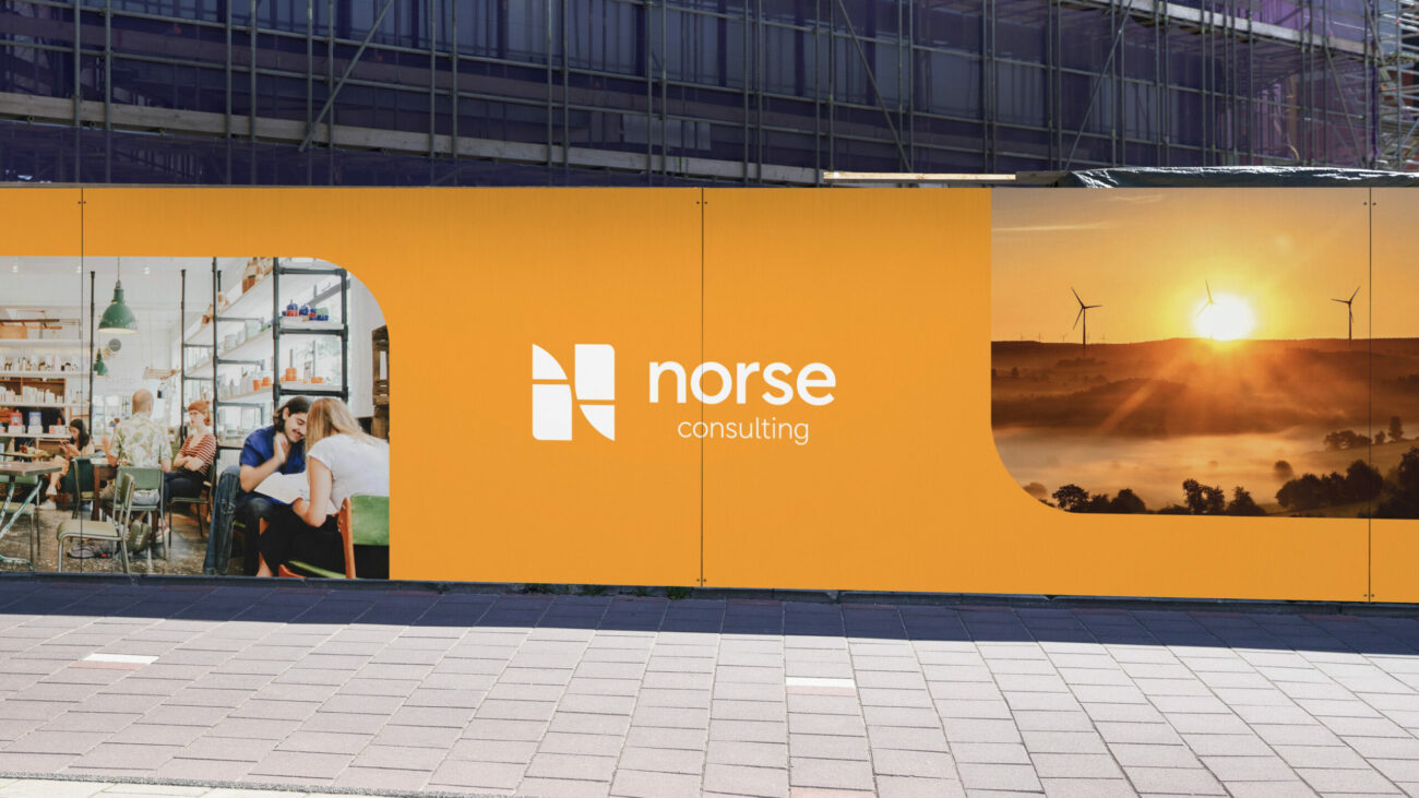
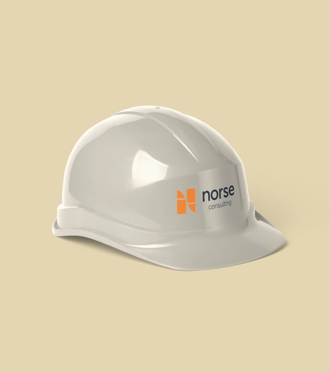
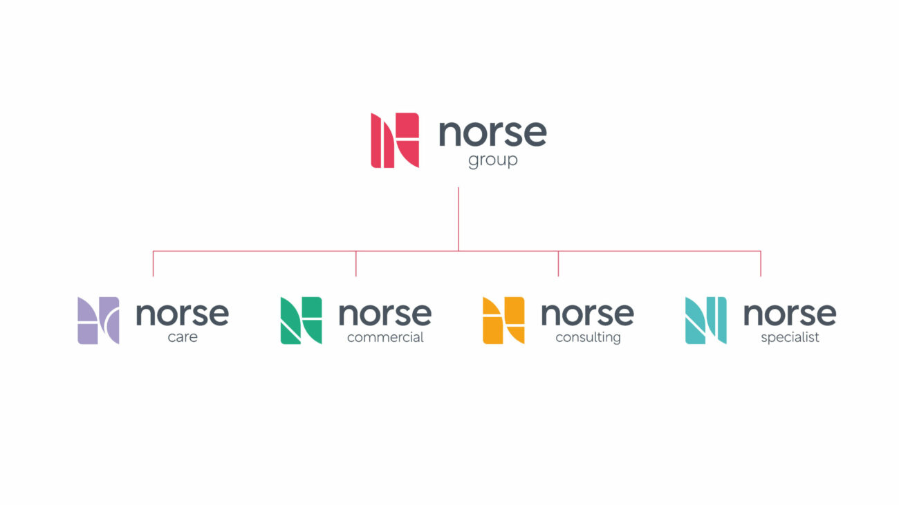
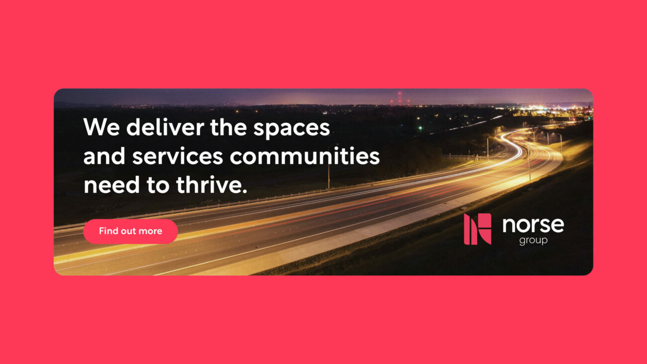
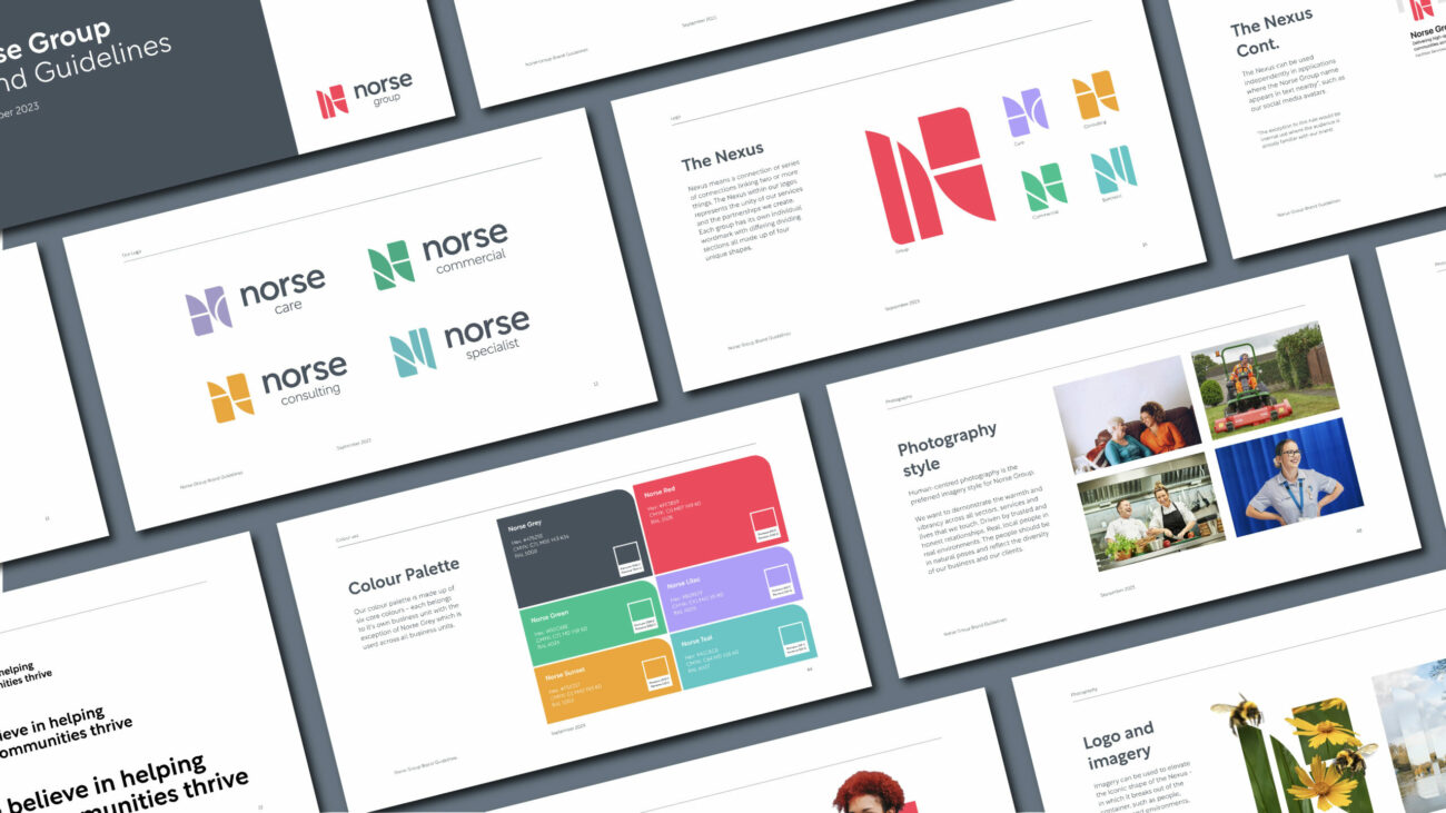
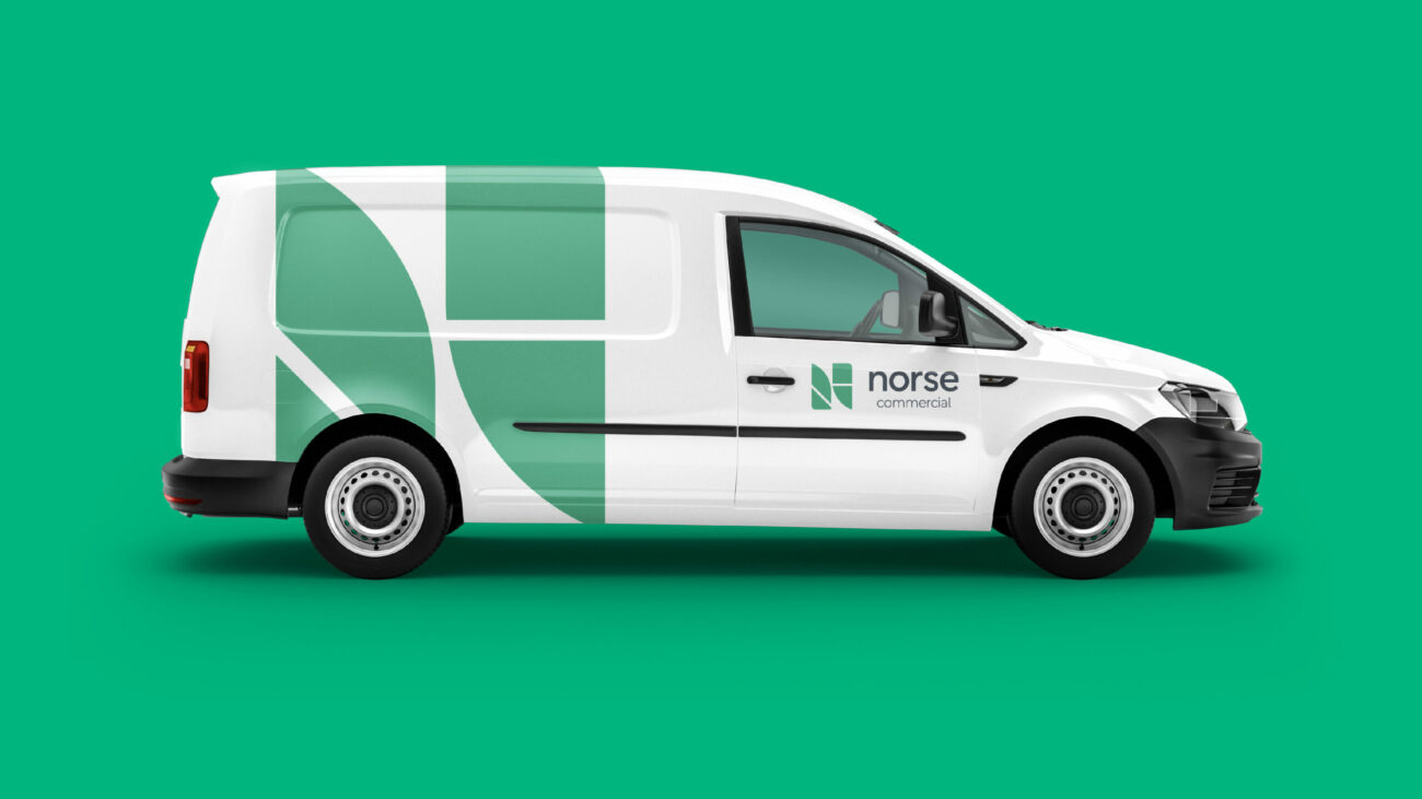
The logo is inspired by the four core business units that form Norse Group: Norse Care, Norse Commercial, Norse Consulting and Norse Specialist Services.
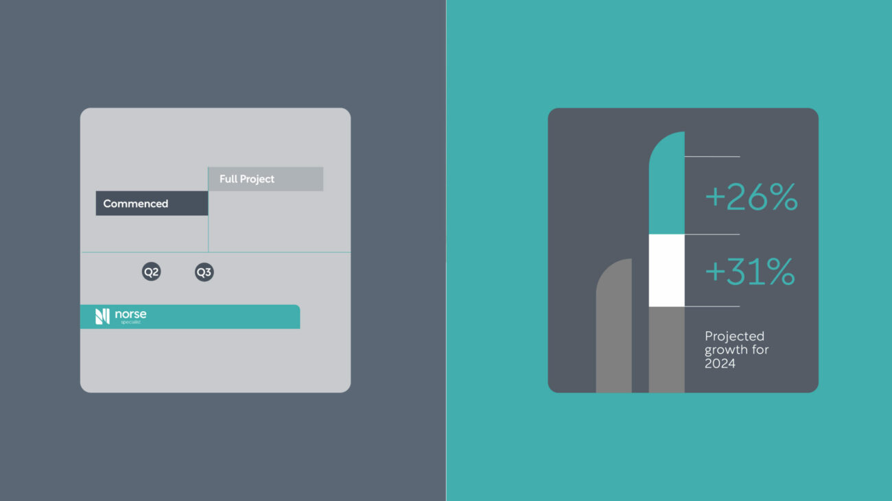
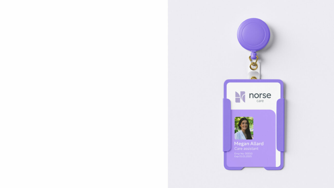
The new design system gives the continuity of a unified group, but allows each business within the group to retain a degree of its own identity.
Each business unit has its own colour and configuration of ‘N’. This also allowed us to integrate the new VI for joint venture partners, who equally retained a part of their own local identity.
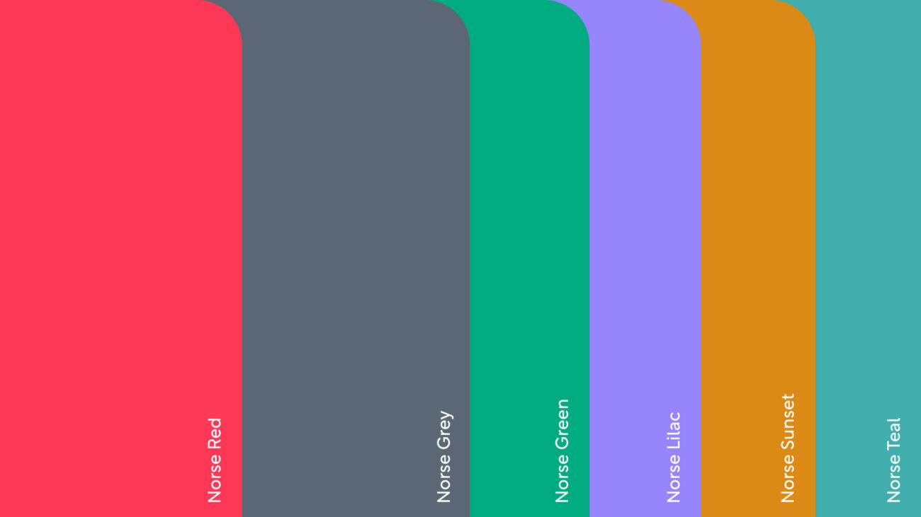
The colour palette aims to capture the warmth and vibrancy of Norse’s mission, filled with positivity and brightness – but also gives the opportunity to feel more professional and corporate when needed.
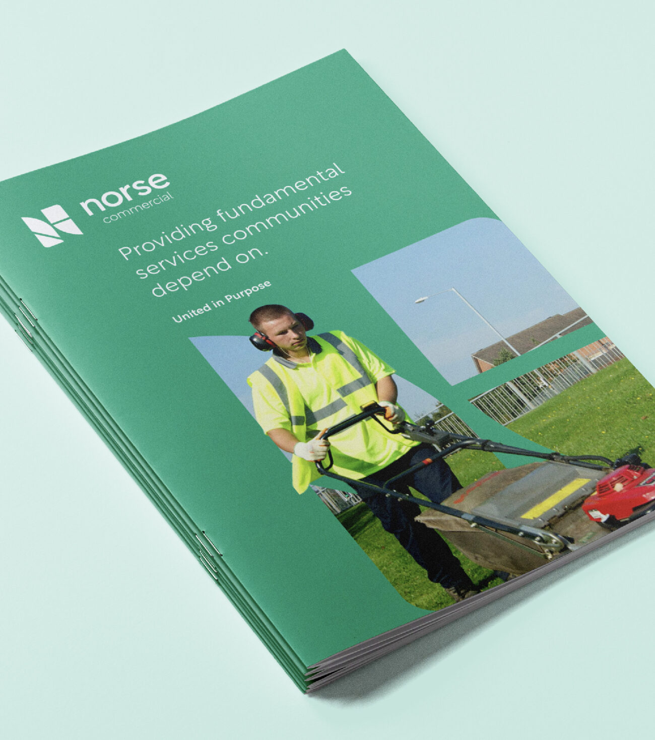
“This design system also includes the use of imagery, bringing a stronger sense of community and people,” explains Craig, Design Lead on the project. “But what I really love about the identity, is that the strategy is so clearly visible within it: the unique areas of the business, coming together.”

The Results
Despite the complicated business structure and disparate proposition, the rebrand was completed successfully and rolled out on time, and budget.
“The size and scope of this project was expansive, with multiple audiences, stakeholders and needs. But we managed to deliver a story and a brand that not only achieved senior-level buy-in but is also felt by the people on the ground,” says Chris. “And will continue to support Norse’s team with the roll-out over the coming year.”
“Borne was asked to develop a new brand for the Norse Group,” says Paul Pawa, Group Strategic Development Director – SMT. “Extensive time was given to understanding the business, its values, and its objectives which in turn produced a result embraced by the whole organisation. Their approach has always been very open, with the ability to refreshingly challenge thinking but also take on feedback in a positive way – a true partnership.”

